Styling
How to Match Colors in an Outfit Without Overthinking It
A practical color framework that removes guesswork and makes everyday outfits feel more polished.

You own enough clothes. The issue is not volume — it is that half of them feel impossible to pair because of color. One wrong shade throws the whole outfit off, and suddenly you are back in the same navy-and-black rotation you promised yourself you would break out of.
Color matching does not require art school theory or a designer's eye. It requires a simple decision framework, a few anchor rules, and the willingness to stop treating every garment as equally interchangeable. Once you understand how colors interact structurally — not just aesthetically — getting dressed becomes noticeably faster and significantly more satisfying.

Why Color Matching Feels Hard
The problem is rarely bad taste. Most people default to safe combinations because they have been burned by one outfit that looked off and could not figure out why. That single experience creates a pattern: stick to what is proven, avoid anything unfamiliar.
Here is the reality: color clashes almost always come down to one of three things — a temperature mismatch, a saturation mismatch, or too many competing focal points. Warm beige next to cool grey can look muddy. Two equally bright colors fight for attention. A pastel shirt under a saturated jacket disappears. These are structural problems, and structural problems have clear fixes.
The good news is that you do not need to memorize a color wheel. You need a repeatable method that tells you which piece leads, which one supports, and which one adds a controlled spark of contrast.
The Anchor-Shift-Accent Framework
Think of every outfit as having three color roles. Not three colors — three roles. This is the distinction most advice skips.
The Anchor
The anchor is the dominant color by visual area. It usually covers your largest piece — trousers, a midi skirt, an overcoat. This sets the temperature and intensity of the outfit. Dark navy trousers anchor cool and quiet. Tan chinos anchor warm and relaxed. The anchor is not the most exciting color; it is the most stable.
The Shift
The shift is a second color that moves slightly away from the anchor without opposing it. Think of it as the same neighborhood, different street. If your anchor is charcoal, the shift might be slate blue or heathered grey. If the anchor is olive, the shift could be cream or sand. The shift adds visual movement without creating tension.
The Accent
The accent is small, intentional, and different. A burgundy belt. White sneakers against a dark outfit. A rust-colored scarf over a grey coat. The accent works because it is contained — it occupies less than 15% of the visual field. When the accent takes up too much space, it stops being a highlight and starts competing with the anchor.
Combinations That Work in Practice
Theory only matters if it survives your actual wardrobe. Here are combinations built on the anchor-shift-accent structure using pieces most people already own.
Neutral Anchors with Tonal Shifts
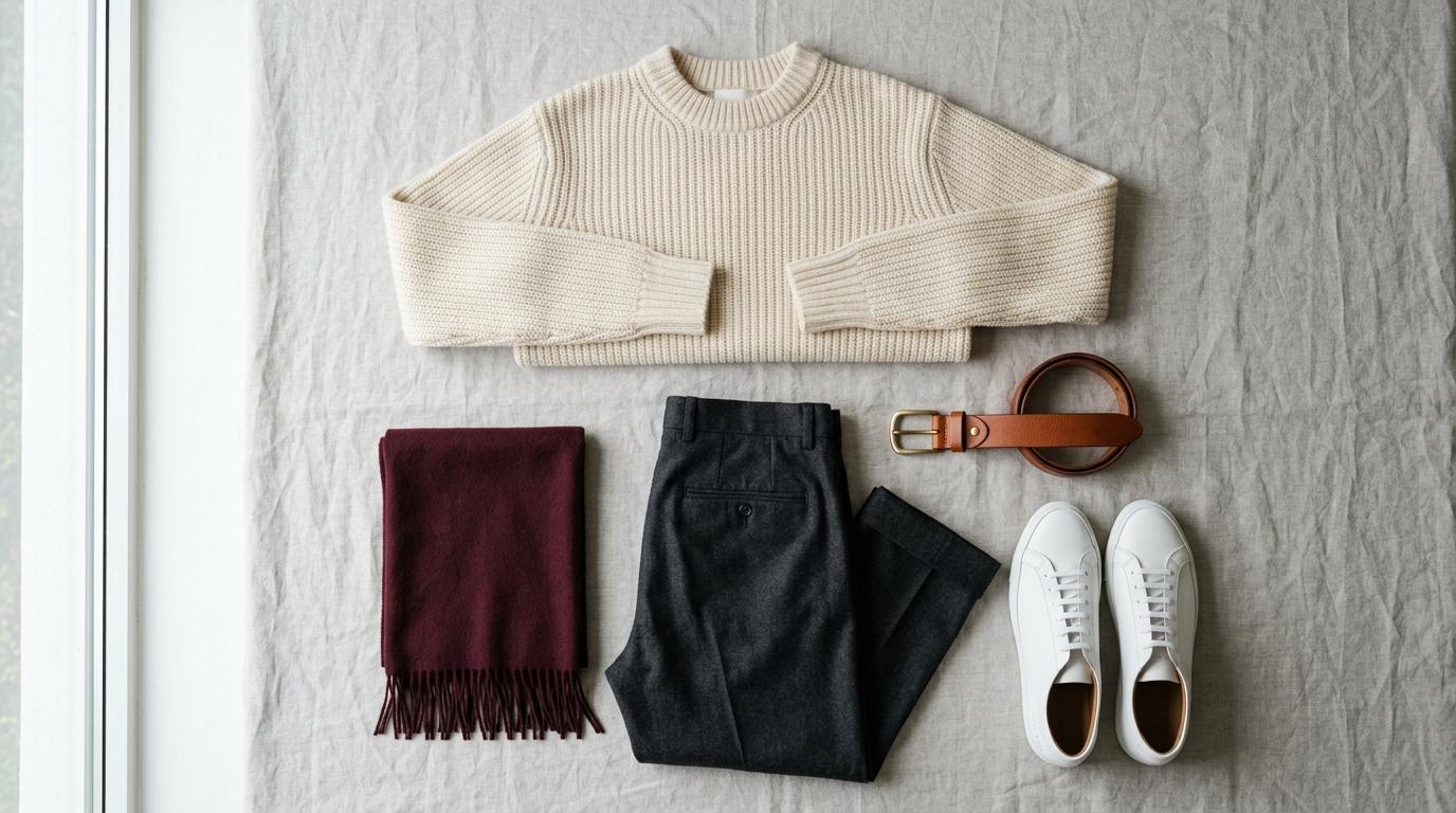
Charcoal trousers + cream knit + white sneakers. The charcoal anchors cool and dark. Cream shifts the upper half warmer without jarring. White sneakers accent by being the lightest point, drawing the eye downward and grounding the silhouette.
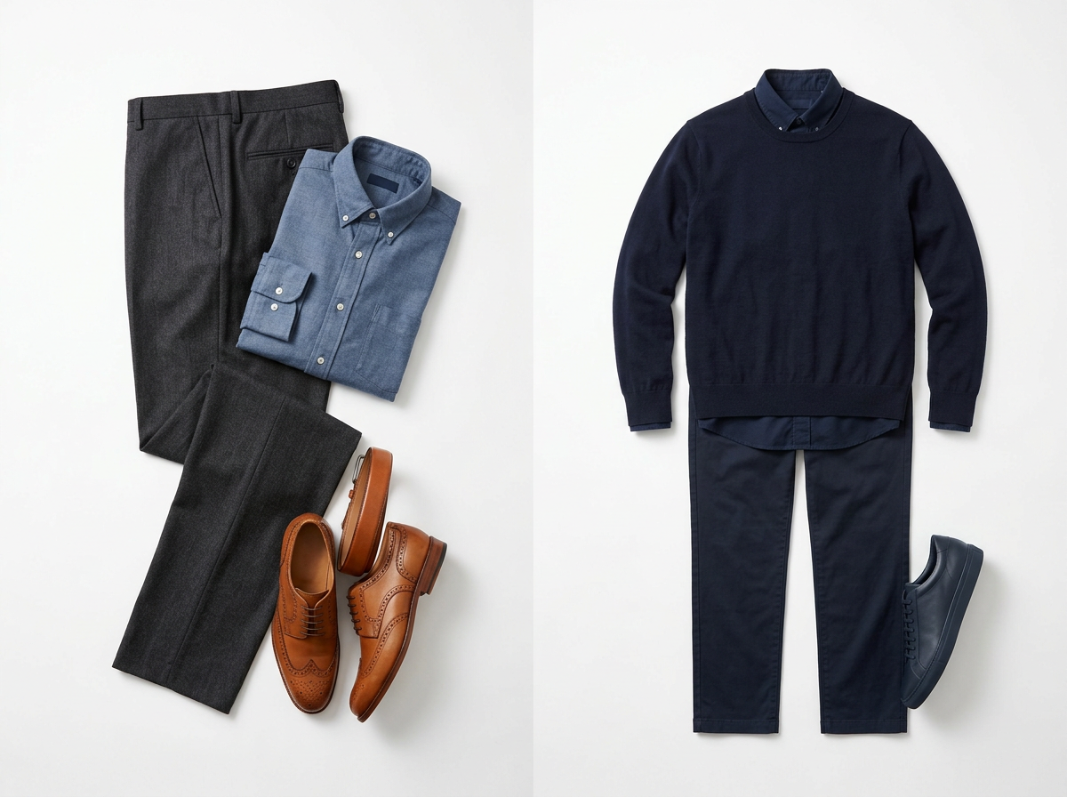
Navy chinos + light blue oxford + tan leather belt. This is a classic tonal combination. Navy and light blue share the same family but different weight. The tan belt introduces warmth without clashing because it is small and contained.
Warm Palette Done Right
Camel coat + chocolate brown turtleneck + off-white trousers. Every piece stays within the warm spectrum, but the lightness variation prevents the outfit from looking like a single block. The off-white trousers do the heavy lifting by creating a break between two close earth tones.
Olive cargo trousers + oatmeal sweatshirt + terracotta cap. Olive reads as neutral-warm. Oatmeal supports without competing. The terracotta cap is small enough to act as an accent that ties the warmth together without overwhelming.
Controlled Contrast Pairings
Black trousers + white t-shirt + grey blazer. High contrast between black and white works when a mid-tone — here, grey — bridges the gap. Without the blazer, the outfit can feel stark. With it, the transition reads as deliberate.
Dark wash denim + burgundy sweater + grey overcoat. The denim anchors cool and casual. Burgundy shifts the mood richer and slightly warmer. Grey outerwear contains everything without adding visual noise.
Common Color Mistakes and How to Avoid Them
Matching too precisely. Wearing the exact same shade head to toe does not look coordinated — it looks like a uniform. A navy shirt with navy trousers in the same fabric weight erases all visual structure. Slight variation — say, navy trousers with a slate or dusty blue shirt — gives the eye something to follow.
Ignoring fabric temperature. A warm-toned linen shirt next to a cool-toned synthetic trouser creates a disconnect that most people sense but cannot name. Fabrics carry their own color temperature. Natural fibers tend warmer. Synthetics tend cooler. Matching the fabric mood often matters as much as matching the hue.
Overloading on accent colors. A patterned shirt, a colored belt, a bright shoe, and a statement watch all compete. An outfit works best with one accent — two at the absolute maximum, and only when they are close in tone. If everything is special, nothing reads as intentional.
Forgetting about skin tone interaction. Some people look washed out in certain shades of grey or beige. If a color consistently makes you look tired regardless of the outfit, the problem is not your styling — it is the shade's undertone clashing with your skin. Move one shade warmer or cooler and the same outfit comes alive.
This is where tools like Loryve's virtual try-on become genuinely useful. Instead of buying three versions of the same sweater to test which grey works, you can compare shades against your actual wardrobe and your own image. It is not a replacement for learning color logic — it is a faster way to confirm what you suspect but cannot verify in a store mirror.
Quick Wins for Tomorrow Morning
Start with one anchor color per week. Pick your go-to trouser color — probably black, navy, or grey — and build three different outfits from it by varying only the shift and accent. This trains your eye without requiring new purchases.
Use white as a reset. When a combination feels off, swap one mid-layer for white or off-white. White neutralizes temperature conflicts and gives the remaining colors room to breathe. It is the most reliable styling reset in any wardrobe.
Photograph your outfits. Colors behave differently in a mirror than in a photograph. Spending ten seconds snapping a quick photo before you leave reveals imbalances you cannot see while wearing the clothes. Over a week, you will start noticing patterns — which combinations photograph well and which ones only looked right from one angle.
Audit your wardrobe by color, not by type. Hang or fold clothes by color family instead of by category. When you see all your blues together, gaps and redundancies become obvious. You might discover you own five dark tops and zero mid-tones — which explains why every outfit feels heavy. A digital wardrobe tool can accelerate this by mapping your existing pieces into color clusters, showing exactly where the palette runs thin.
Color matching is not about perfection. It is about reducing the number of mornings where you stare at a full closet and feel like nothing works. A simple framework, a few practiced combinations, and an honest audit of what you actually own — that is enough to make getting dressed feel like a decision instead of a problem.
Related articles
Occasion Dressing
Occasion Dressing Decoded: What Every Dress Code Actually Means
Cocktail attire. Smart casual. Black tie optional. Every invitation carries a dress code, and most of them are misread. Here is the definitive guide to what each one actually requires.
Wardrobe Strategy
7 Wardrobe Pieces Worth Spending More On (And 5 Where It Doesn't Matter)
Spending more does not always return more. But in certain wardrobe categories, quality is the only thing that works — and the wrong call will cost you twice. This is the analytical breakdown.
Occasion Dressing
Date Night Dressing When You Have No Idea Where to Start
Standing in front of a full wardrobe with nothing to wear is a date-night rite of passage. But the problem is almost never the clothes — it is the brief. Here is how to clarify it and dress with confidence.